

This week, Alison Morton, author of the successful Roma Nova series of thrillers, discusses the when, why and how of changing your book covers. Given that she and her cover designer, Jessica Bell, have done a damn fine job of it, you’ll be interested to read on!
First of all, apologies to Bill for mangling Hamlet’s lines, but weighing up whether to change covers for an established series does make one ‘draw [one’s] breath in pain.’
Excited in the run-up to the publication in 2013 of INCEPTIO, my first book, I was stunned by the cover that SilverWood Books produced. Here was the embodiment of my book: imperial purple, a gold eagle, symbol of Roman power, yet in a thoroughly modern design. Added to that, the ‘proper’ Roman font – Trajan Pro – as seen on inscriptions still visible across Europe. Brilliant!
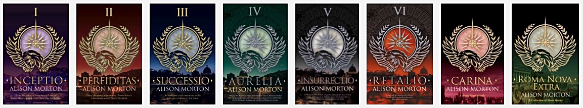
And so it has been for the past five years and eight books. Each book has been published with a different jewel-like cover echoing the contents, but the eagle graphic constantly present, making the Roma Nova brand distinctive.
But times change. People change. Habits and wishes change. When historians write about our age, the one expression to characterise it will be ‘continuous change’.
My book sales have been steady, occasionally spiking. From the comments and reviews written by readers, I gather they enjoy the stories enough to give them hundreds of five stars across the series. But I wanted to introduce Roma Nova to more readers. So I dived into the murky business of marketing, beginning with an analysis.
What did potential new readers expect when they saw my book covers? Did they see adventure thrillers featuring strong heroines, a touch of history and mystery, tales of courage, failure, triumph, heartache and resolve? Hm. Perhaps the eagle image, dark colours and formal Roman script no longer had that elusive ‘pick-me-up’ element. Learning point: Emotion and character needed to be brought in.
Did the existing covers convey action and movement? Certainly, they conveyed strength and purposefulness, but there was no hint of risk, personal danger or taking the initiative. And you can’t say that either of my heroines, Carina or Aurelia, is backward in any of those aspects!
Learning point: Show some dynamism.
People vs. patterns. I rejected a cover with a face in 2013 because I couldn’t see it fitting within the graphic. It would have confused the impact of the eagle. From a five years’ later viewpoint, I still think that was the right decision then. Trying to fit everything together is not a good approach, nor is overcrowding a cover. The whole concept needed a rethink. Learning point: Don’t tinker – start again.
It’s hard-headed, but in marketing terms a book cover needs to tell readers what the book is about and entice them to pick it up – all within a second or two. If the cover isn't compelling enough to make passers-by (real or virtual) look further by reading the summary and reviews, they won’t buy.
Researching this was a hard process; I’m not a trained or professional marketer. However, I have run small businesses and am aware how important marketing is. And these days, more than ever, the impact must be instant.
Taking the decision to change the whole look of the Roma Nova covers was excruciating. But by now I had five solid years of experience in the book world: interacting with readers, absorbing reviews, listening to fellow authors, discovering new techniques and trends. I was also expanding the series, firstly by dropping in a novella (CARINA), then a collection of short stories (ROMA NOVA EXTRA). Currently I’m drafting a novella set in the 1970s featuring Aurelia, set between AURELIA and INSURRECTIO, something that would further mess up the existing numbering order!
A fresh approach was needed, and this was the perfect time to reassess and restructure the whole series. So I split the stories into two strands within the Roma Nova series: Carina Mitela adventures and Aurelia Mitela adventures.
Readers have described my books as a cross between Lindsey Davis’ Roman detective Falco and The Hunger Games. They’ve also been likened them to Manda Scott’s and Kate Mosse’s books. Conn Iggleden, Simon Scarrow and Elizabeth Chadwick (among others) have said nice things about them. I’d like to think they’d also appeal to readers of JD Robb and Robert Harris (or is that hubris?).
Back to the covers…
I commissioned designer Jessica Bell to draw up some concepts for the whole series.
I asked her to keep the original background colours: INCEPTIO purple, PERFIDITAS blood red, CARINA in between, SUCCESSIO blue, AURELIA green, INSURRECTIO black and RETALIO amber, and to include the signature eagle graphic in the mix.
She would draw up three concepts and I then had to choose one. But was it really up to me? Did it matter what I thought or felt? No. Definitely no. Which would most appeal to readers? And address the learning points from my analysis?
Disassociating yourself from your book, your baby, that part of your soul that you’ve put on public view is the hardest part of the process.
Jessica was a joy to work with: imaginative, professional and supportive, especially of some of my dafter ideas. But she was also ruthless in a very friendly way when my suggestions were off-piste; she was right every time.
Delighted isn’t the right word. Thrilled is a bit nearer. Shocked and overwhelmed in a very positive way is better still. After five years of beautiful but rather sober covers, the books have taken on a new, dynamic life. I think Roma Nova is about to storm off on some exciting new adventures.
Late 1960s Roma Nova. Retrained as an undercover agent, ex-Praetorian officer Aurelia Mitela is sent to Berlin to investigate silver smuggling, but barely escapes a near-lethal trap. Her lifelong nemesis, Caius Tellus, is determined to eliminate her and ruin Roma Nova.

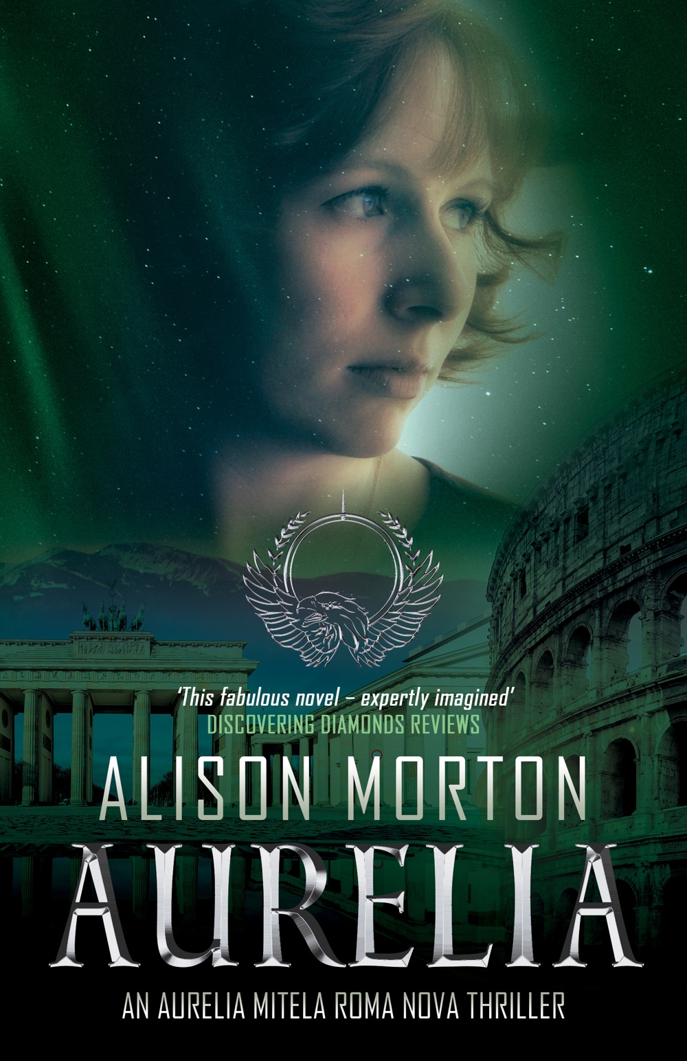

A former military commander, Aurelia is one of Roma Nova’s strong women, but she doubts in her heart and mind that she can overcome her implacable enemy.
And what part does the mysterious and attractive Miklós play – a smuggler who knows too much?
When Caius Tellus strikes at her most vulnerable point, Aurelia must make an agonising decision – her country, her love or her child?
First in the Aurelia Mitela adventures, where Roman fiction is brought into the 20th century through an alternative history lens and first of the AURELIA trilogy. INSURRECTIO and RETALIO complete the trilogy.
– Historical Novel Society’s indie Editor’s Choice for Autumn 2015
– B.R.A.G. Medallion
– Finalist, 2016 HNS Indie Award
Paperback: https://myBook.to/AURELIA
Amazon: https://myBook.to/AURELIA_Kindle
Kobo: https://store.kobobooks.com/ebook/aurelia-30
B&N Nook: https://www.barnesandnoble.com/w/aurelia-alison-morton/1121827041?ean=2940151557450
Apple: https://itunes.apple.com/us/book/aurelia/id1378216297
Alison Morton writes the award-winning Roma Nova thriller series featuring modern Praetorian heroines. She blends her deep love of Roman history with six years’ military service and a life of reading crime, adventure and thriller fiction.
A ‘Roman nut’ since age 11, Alison misspent decades clambering over Roman sites throughout Europe. Fascinated by the mosaics at Ampurias (Spain), at their creation by the complex, power and value-driven Roman civilisation, she started wondering what a modern Roman society would be like if run by strong women...
Now she continues to write thrillers, cultivates a Roman herb garden and drinks wine in France with her husband.
Connect with Alison on her Roma Nova site: http://alison-morton.com
Facebook author page: https://www.facebook.com/AlisonMortonAuthor
Twitter: https://twitter.com/alison_morton @alison_morton
Instagram: https://www.instagram.com/alisonmortonauthor/
Goodreads: https://www.goodreads.com/author/show/5783095.Alison_Morton
Alison’s Amazon page: http://Author.to/AlisonMortonAmazon
